Subtle & powerful changes for your mailing list
I’ve been using email marketing tools for a while now. There are some general approaches, tools, tricks that can improve the overall perception of your emails. Even though I’m a huge fan of ConvertKit which I strongly encourage you to try, the approaches described below are mostly tool independent and should work in any tool.
Your footer, your links
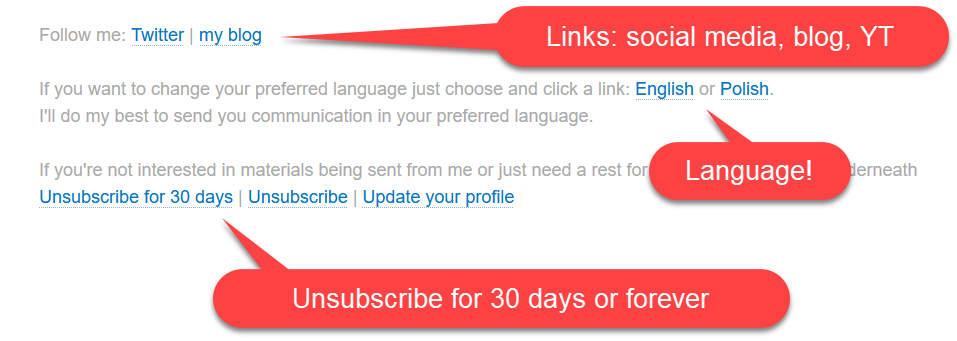
One of the most underappreciated parts of an email is the footer. Beside dealing with RODO and/or GDPR legal aspect of sending email you can use it to provide some value to your subscriber.
The first thing that I encourage you to do, is to put your most important links in there. What kind of links?
- Your social media accounts, if you have any.
- A link to your blog, YouTube channel
- A link to your ever-green product?
This section doesn’t have to scream and be written in bold. All you have to is to provide some potential engagement to a subscriber or a person the email will be forwarded to.
Unsubscribe for “ever” or for “30 days”
Sometimes people just need a break. If they can’t take a break they will resign. To stop them from resigning because of a temporary problem, you can include a link that will provide an option to pause emails for 30 days. I’ve described it in detail in this post already.
Languages, one or many
If you run a bilingual mailing list, it might be demanding to find out what’s the preferable language of your subscriber. One of the things that you can do is to let people choose and add another option for selecting the langu age. In my case, people can choose between Polish and English. The whole process is again supported by tagging or untagging people who select a link with a specific language (I assume English, unless you explicitly state that you prefer Polish). Again, this is done by a custom link like in the previous example.
Short circuiting the clicks
This might sound like a hoax or a dark pattern, but in my opinion it’s about providing the best possible outcome. Let me provide you an example first.
When sending a sequence of email during a sales window of a specific product (for instance asyncexpert.com), the last day is always filled with many orders. A subscriber who was presented with all the attributes of a product doesn’t need to visit the landing page. They already know everything about a product. Forcing them to click through the landing page is not needed. To short circuit the clicks, the link that is provided directly guides them to the basket page. The last day is about the final decision, not about visiting landing pages.
Naming this link can make a difference! Nobody wants to click a link like sgfgfdbbxcbafljf.com/basket?usdfisg=23534534. Make it readable, or even replace it with just a product name!
The image
The last but not least, let me share the image of the footer in my mailing setup. Again depending on the tool and the styling, it might look a bit different

Summary
I hope you found this improvements interesting and that you’ll give it a try. As always, if you don’t have a mailing list yet but you’d like to start, I encourage you to try out ConvertKit.


