Efficient and simple email marketing for an online course
How about sending a few emails during one week when selling your online product? How complex can it be? How to make it in an efficient way that will work? How to provide an option for staying with you for a bit more for all the receivers, that might be not interested in this specific offer at this specific time? In this post I’ll show you some of approaches that I use. The post is based on ConvertKit, the tool that I encourage you to try out if you don’t have your favorite mailing tool yet.
Too many emails, unsubscribe me please for some time
There are cases where emails might be delivered to a person that is not that interested in an offer at the specific time. There are many reasons for this:
- loosing interest in a mailing list over time
- inability to use the offer at the specific time (personal issues, budget)
- wrong tagging/segmentation (this will be discussed later)
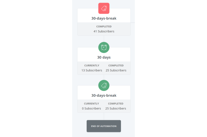
In all the cases, it’s good to provide an alternative option for the mighty unsubscribe button. Even, if a person cannot provide feedback in this specific situation, sometimes having just 30 days without any email is more than enough! That’s why I introduced the unsubscribe for 30 days.

This is applied globally. This means that if any person is unhappy with any email or just wants to have the inbox zero without reading emails, they may click in any email and just apply it. To make it work the following elements of ConvertKit need to be configured:
- custom unsubscribe links for the custom link and action
- an additional
tag, in my case named30-days-break - filtering of subscribers when sending emails, to exclude this which have
30-days-break - an
automation(ConvertKit workflow) that will add the tag after clicking the link and remove after 30 days (see below)

With this, all the emails allow subscribers to just freeze their subscription whenever they want to.
I had two conversations related to this feature. The first was initiated by me, whether or not it is a dark pattern. Are we misguiding people to click the wrong link? After verifying with several people, I was ensured that the footer is clear and readable and it is not similar to all the never ending chains of “unsubscribe me but provide xyz”. The second conversation was really short and I was provided feedback that this approach is simply awesome. It looks like the footer stays as it is!
Tags, products and segments
One of the most important parts of ConvertKit’s tooling are tags, products and segments.
Tags are labels that can be attached or removed from a specific subscriber. They can be gained when clicking a link or by running an automation. It’s just a label that is attached or not to a specific person.
Products are similar to tags in a way, that they are also assigned to a specific subscriber. Beside being attached, every product has it’s price value, etc., meaning that you can see these details in ConvertKit itself. In this case all the courses that were bought were reported as product purchases by an integration, and were visible in ConvertKit.
Segments can be thought of as formulas that are calculated from various sources, for instance tags and products. It’s easy to imagine that we could have a segment of potential buyers (prospects) that might be interested in a course. If you bought a course, you should be removed from this segment to stop sending all the marketing emails. This is how it was done:
- people willing to receive information (this excludes
30-days-breakand a few more) - without people that bought the English version of the Async Expert
- without people that bought the Polish version of the Async Expert
With this, it’s really easy to send a broadcast (a one time email) to all the Prospects: Async Expert EN or Prospects: Async Expert PL.
Reviewing and scheduling emails
The last part is mostly about writing emails in general and scheduling them. ConvertKit enables you to write drafts of your broadcasts and keep them without being scheduled. This is a very good practice as there’s always some polishing and tweaking that you want to apply to your email. In this case there were a few things that were checked a few times:
- links in an email - whether they send to a proper language version of the course
- bolding - whether the most important information is bolded and visible to a user that wants to skim through the email
In our case, leaving an email for a few days and then review it again worked amazingly well. You learn a lot through the process and sometimes you might add a thing or two, or remove something.
WYSIWYG
The last part is strongly connected with the new editor in ConvertKit. It allows you to view the whole email, including the custom footer etc. Sometimes, especially when adding videos to the email it was nice to see it as a whole. Again, it’s not something important as I’m writing this post in MarkDown that will be transformed to a static page, but still, for some people it might be beneficial, especially when playing with more advanced graphics etc.
Summary
I hope you found this post interesting, especially, if you’re planning releasing your own product. If you’d like to try out ConvertKit, I highly encourage you just follow my link ConvertKit.


